
B2B Flight Booking Experience
Redesigning Al-Attar travel agencies platform to be more convenient, efficient, and easy to use.

Project Overview
Al-Attar has built a platform for travel agencies to handle their reservations, from the initial search to the final payment. At this moment, the portal is targeting B2B, but it will soon grow to B2C, therefore the portal style and design should be appealing, pleasant, and convenient to the end-user in order to provide a seamless experience.
The focus was on the flight booking process: How users can search, find, and select flights on desktop.
Our goal was to improve the UX design process, and heuristics, design a prototype and create a detailed set of accompanying wireframes. Everything needed to start working with our team of developers to get the web app built.
I started by researching the current state of the portal, by conducting a heuristic evaluation, I looked at a variety of different approaches and narrowed my focus to a subset that seemed particularly promising.
Then I did competitive research, an online survey, and usability testing before creating affinity diagrams, a user journey map and a user flow. I created a paper prototype to gain insights into how real people might use the portal. Based on these findings, I designed and built a high-fidelity prototype that we could use for further testing.
Finally, I created a set of detailed wireframes that specify every element on every screen. Throughout this process, I kept the user experience front and centre, making sure that our designs were easy to use and understand. As a result, we were able to create a booking system that is both user-friendly and efficient.
My role
I directed this project and was assisted by a team of five, which included three developers, a QA, a business analyst and a project manager. I was the primary individual responsible for the User Experience and the deliverables of this project.
Client:
Attar Travel
Role:
UX/UI
Team:
Brackets Technology
Date:
2019

Project scope
The primary objective was to evaluate and improve the existing flight booking experience, with an emphasis on building a simpler and more intuitive booking process.
Exploring the problem
Understanding the right problem is half the battle. Despite the fact that there are hundreds of travel booking websites available today, flight comparison and booking remain difficult tasks.
It seems that most users abandon their booking process due to difficult and unnecessary stages and a convoluted flow. The user used to spend a lot of their important time completing the procedure, which made the whole process more frustrating.
RESEARCH
RESEARCH
RESEARCH
RESEARCH
RESEARCH

Research and Discovery
The initial stage in the problem-solving process is research. I used the triangulation method to establish credibility and validity in the study findings. Competitive benchmarking, usability testing and an online survey established a pattern that aided me in gathering data from many sources. This prevented the creation of a factually inaccurate product.
Heuristic evaluation
Since Al-Attar already had a website, we began the research process by evaluating it against industry standards. the following is a summary of the top ten pain points:
Competitive benchmark
Before analyzing any flight booking website, we kept in mind the objectives of the business. Our objective is to increase bookings, then the website should be designed to funnel users toward the booking process.
In addition, it is important to consider the competition when redesigning the booking experience. What are the other websites in the market doing well? What can be improved? By understanding the competition, we will be able to better understand the market and redesign the website to provide a superior booking experience.
I examined four airlines’ home pages, flight searches, booking procedures, and booking adjustments. Etihad, Air Asia, Emirates, and British Airways. This resulted in a page-by-page list of findings on good practices, pain points to avoid, and ways to improve the experience.
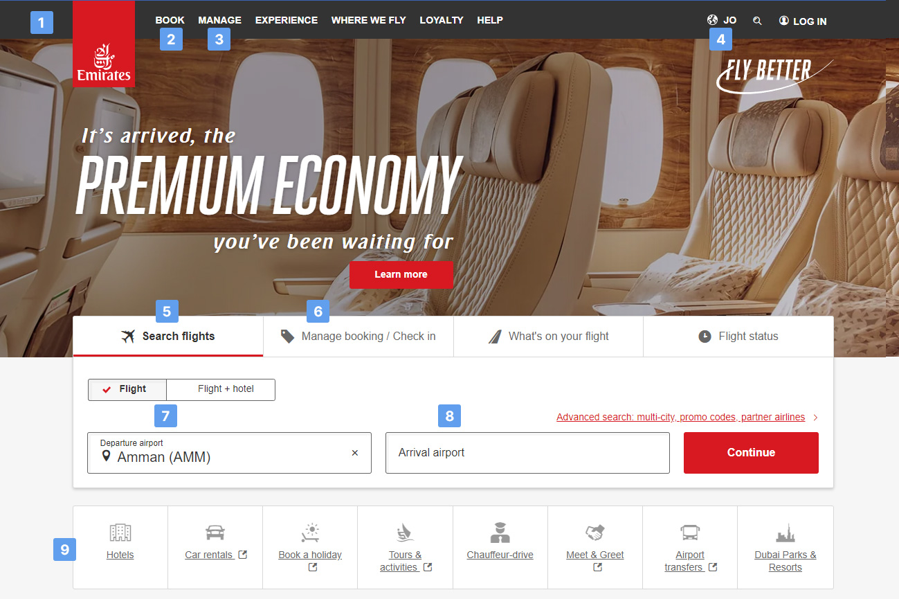
- Overall clean design
- Book option number one
- Manage option number two
- Country/Language/Log in at the top right corner + System knows my country and language
- Search flights – first option, good size and default selection
- Manage booking-second option, good size and fast to find
- My nearest airport comes by default
- Good size of fields
- Offer more services at a glance
- “Continue” doesn’t tell me what is going to happen next
Conclusions
Home page
- Provide a clean design
- Place Country/Language/ Log in at the top right corner System should know the user’s country and language Search flights should be the first option, with good size and to show the user’s nearest airport
- Provide only concise information
- Offer a good size of fields
- Find the suitable wording for the buttons e.g. “Search flights” button tells me what will happen if I click it
- Offer more services at a glance
Flights search
- Provide the “search for flights” at the top of the page, it is what most of the users are looking for.
- The system should know the user’s nearest airport
- When typing a destination, show a dropdown with options Calendar should occupy a good percentage of the “Search area”
- Be concise when adding passengers
- Provide a clean design, easy to follow, straightforward information and good size of elements
- Provide an accessible way to view previous and next day flights
- “Outbound flight” and “Inbound flight” seem to be good wording
- Avoid opening more dates on another page, in a non-friendly way
- Avoid redirecting to multiple pages when the information can be displayed on the same page
- Avoid cluttering the “search area”, and make obvious what the user needs to fill
- Provide information with the use of icons when possible e.g. In details of the flight icon showing “night time flight” or Outbound/Inbound flight/ traveller
- After selecting a destination, automatically open the calendar – guide the user to the next step.
Booking process
- Showing the progress of the process at the top of the page looks helpful for the user.
- Be accurate on the steps and progress. If there are many options for flights, providing a sort function ability can be helpful for the user
- Always provide a summary of the booking, including Details of the flight
Seats, Extras, Taxes and fees, Total price. - Show the summary of the booking on all screens and update it until the user finishes the process
- Make obvious how the user is going to proceed with payment.
- When asking for details of passengers ask for their prefered meal
Online Survey
We surveyed 100 people and asked them a number of questions regarding their travel booking habits. The online survey was created with ‘Smart Survey,’ and the user input was collected in quantitative and qualitative data structures. The survey questions are listed below.
- When was the last time you went to an airline’s website?
- What prompted you to visit an airline’s website? What were you attempting to accomplish?
- Were you successful in completing your task that day?
- What aspects of the website would you change? What changes would you make?
- How long does it take you to complete the booking?
- Do you want to choose your seat together with your ticket?
- What is the most distracting thing about airline booking websites?
- What type of step do you prefer while purchasing a ticket?
We found that the majority of respondents visit airline websites at least once a year and that most do so in order to book a flight. While the majority of respondents were able to complete their task on the first try, many said that they would like to see improvements in websites’ design and functionality. In terms of booking time, we found that most people take less than 15 minutes to book a flight, but that some people spend upwards of an hour.

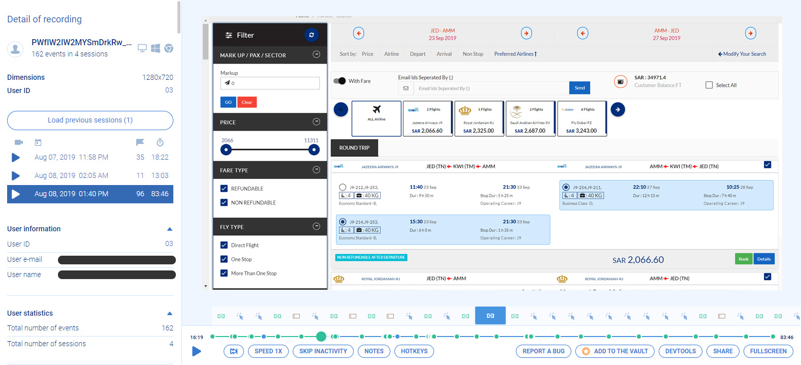
Usability testing
In order to get a better understanding of how users interacted with the current website, we recorded users’ behaviour on the website and tried to understand how they interact with the software. I have identified some of the user roadblocks, user goals and user behaviours with the help of this practice.
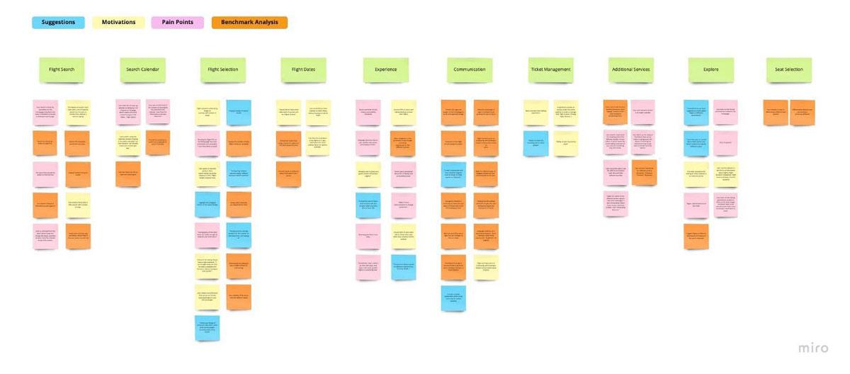
Affinity Diagram
After gathering the data from the useability testing and the survey, I created an affinity diagram to help organize the feedback I received. I identified ten main categories:
- Flight Search,
- Search Calendar
- Flight Selection
- Flight Dates
- User Experience
- Communication
- Ticket Management
- Seat Selection
- Additional Services
- Exploration
For each category, I listed the specific comments and suggestions that were made by participants. This allowed me to quickly see common themes and identify areas that needed further investigation. The affinity diagram was a valuable tool in helping me to analyze the data from my user research.
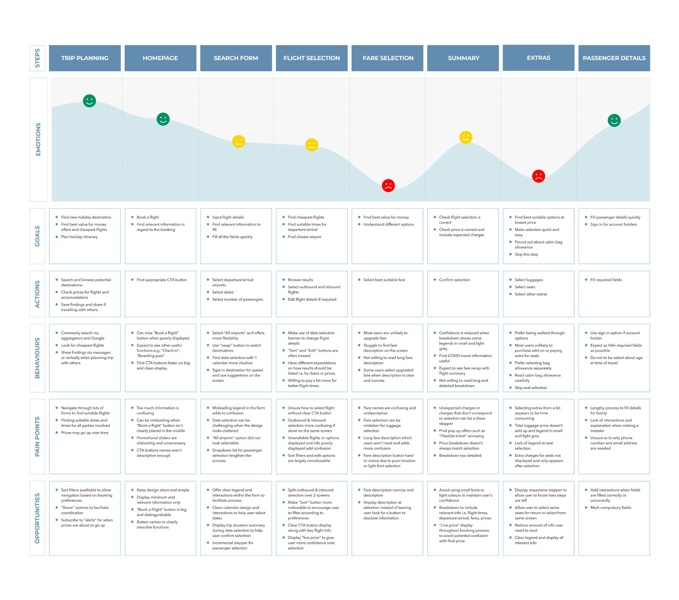
User Journey Map
Using all the available data, I created this user journey map. The user’s sentiment as he navigated through the product was captured in several aspects including Goals, Behaviors and Contextual pain points along with Positive Notes about his experience within them which allowed for greater focus on what really mattered.
DESIGN
DESIGN
DESIGN
DESIGN
DESIGN

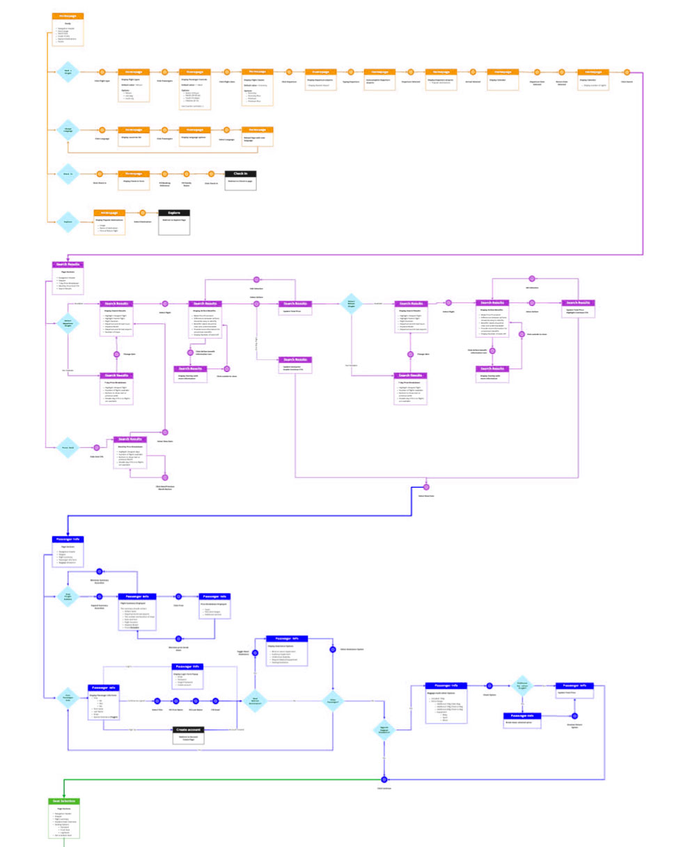
Userflow Diagram
Using the data I gathered I started creating a user flow diagram that would help our customers complete their bookings easily. To do this, I first mapped out the steps involved in the booking process. I then created a diagram that showed how the user would move through the system, from start to finish.
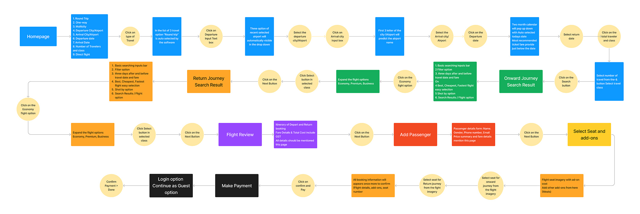
This diagram was then used to create the final user flow diagram. To ensure that the booking process was as smooth and easy as possible.
Sketches & Wireframes
With the big picture finally in place, I was able to start sketching out my ideas for how everything will work together. This includes what page layouts and interactions might be possible on each individual webpage as well.
Once I had a general plan in place, I started to add more detailed content such as labelling and potential interactions. By taking the time to sketch out my ideas beforehand, I was saving myself a lot of time later on.
I used sketching to get all of my ideas down on paper, regardless of what they are, and see what stays. I pondered my own thoughts, jotted down notes, and compiled important points for further research.
Once I was pleased with my sketches, I moved on to creating low-fidelity grayscale prototypes in Figma. This helps me to ensure that everything I want to include fits inside the frame without sacrificing the experience’s integrity. I created different screen states to show the process from start to finish, highlighting the interactions and content that would be delivered.
When the designs were finished, I created official handoff wireframe documentation, detailing every interaction the product will make. This included every screen state as well as any other pertinent information that the developer would find beneficial.
High-fidelity Design
Once I had decided on a visual style for the interface layout, I began to add additional details to the sketches and wireframes by converting them into high-fidelity wireframes.
I incorporated aspects in these wireframes that directly address users’ goals, wants, and problems while leveraging common design patterns observed in other airline apps.
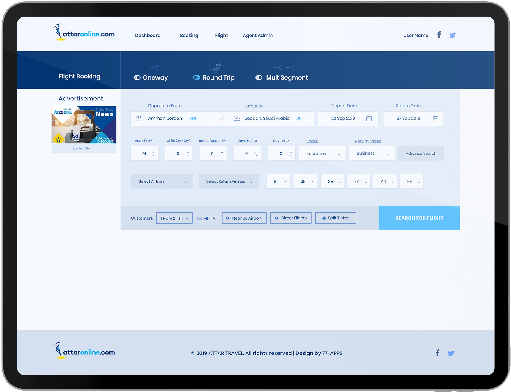
Search Page
The Flight Search Form focuses on the important information needed to search flight options: departure and arrival airports, dates, and the number of passengers.
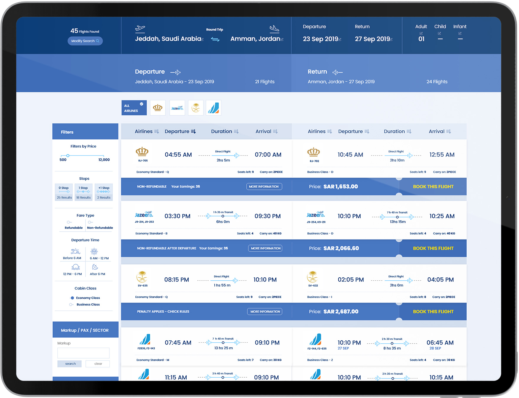
Search Results
According to the user research, users had varying expectations for how the flight results should behave. I selected to display flights by departure time as the default option since most users are prepared to make a trade-off between price and timing when making their choices.
Having said that, it was also critical to include a prominent “Sort by” option on the screen so that users could rearrange the results to their preference.

TESTING
TESTING
TESTING
TESTING
TESTING
Usability Testing (first round)
After completing the initial prototype, I conducted moderated usability testing with 8 individuals. The idea was for them to book an entire flight. While the app used design principles existing in previous communication applications, I was intrigued to see if the new functionalities would provide complete solutions to the difficulties discovered during the research process.
Useful Insights
The first iteration
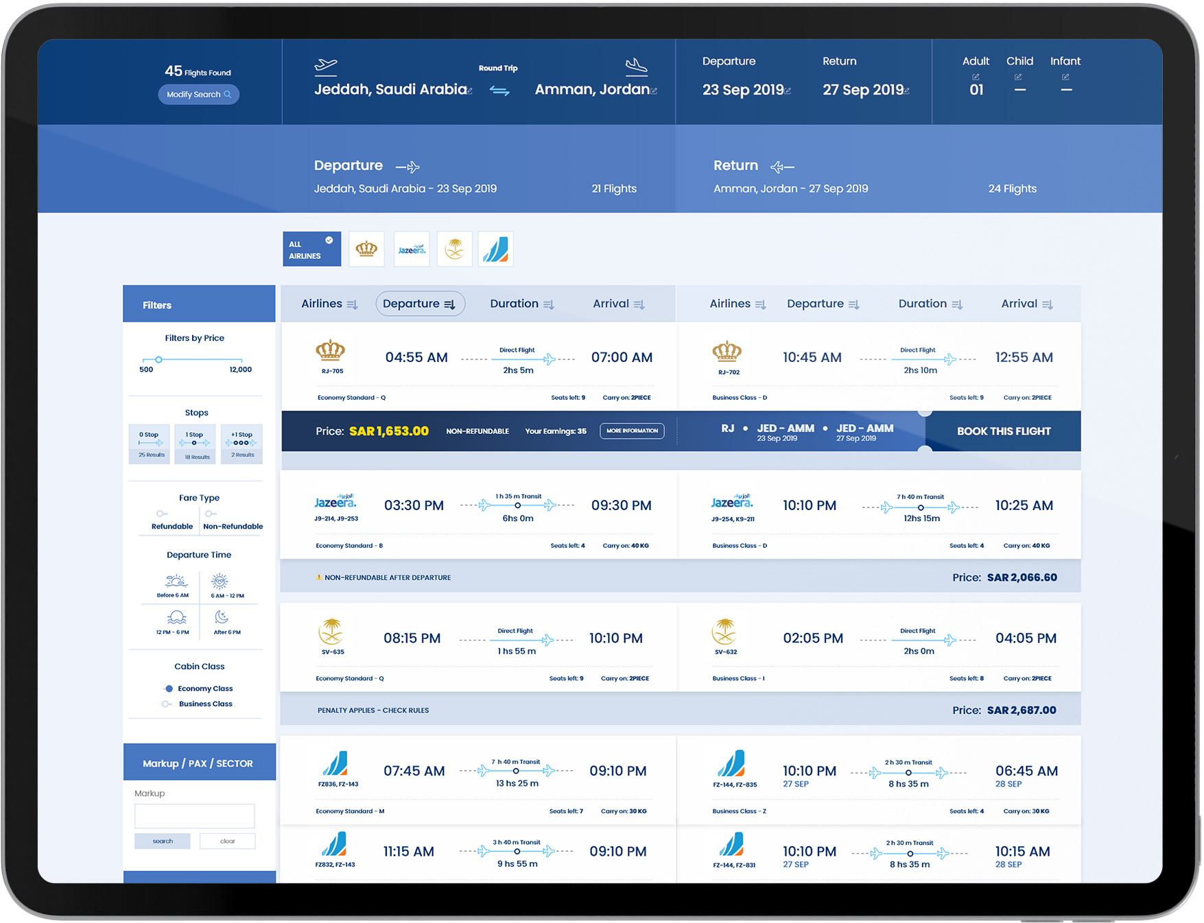
Flight Selection
When I first designed the “Sort by” button, it was just a flat black box. But after testing and tweaking its design for more distinguishability in sorting screentests without focusing on that function as much – because we noticed people often use these features interchangeably- I decided to make differences between them clearer with different colours or textures at first glance instead of having everything blend together seamlessly like before!
Baggage options
Names for the luggage options have been changed to “Standard 15kg” and “Heavy 24”. The aim was to suggest a mental load in these names so that it requires less effort from users when choosing between them, helping them make their decision quicker.
Usability Testing (second round)
I conducted a final round of usability testing to review the most recent changes. The sessions were unmoderated, and I solicited input from 15 participants. The aims were quite similar to the first round in that I wanted the participants to test the menus included in the booking process. However, I was curious to hear whether the improvements made would alleviate the problems reported by prior participants.
Useful Insights
I was glad to notice that the improvements made in the previous first round of testing solved the problems encountered by earlier participants. However, a couple of other issues surfaced.
IMPLEMENTATION
IMPLEMENTATION
IMPLEMENTATION
IMPLEMENTATION
IMPLEMENTATION

Final Designs
We arrived at the final design after several rounds of user testing and feedback, by considering the needs of the target audience and what would be most useful and functional for them. We took into account that the website would be used by travel agents and travellers of all levels of experience, so it needed to be easy to use and navigate with a clean and modern interface.


RESULTS
RESULTS
RESULTS
RESULTS
RESULTS

Results
Post-design, we conducted multiple usability sessions (pre and post-launch). We observed and recorded user behaviour while they accomplish tasks on the new website.
We also asked users questions about their satisfaction with the site experience. Based on our findings, we made changes to the design and layout of the website. We also created new content and added features to improve the user experience. Our goal is to continuously improve the website so that users have a positive experience.
In terms of metrics, the new website design delivered:
75
Reduction in time to complete a booking
60
Increased conversion from home to search
28
Higher home-to-pay conversion
TAKEAWAYS
TAKEAWAYS
TAKEAWAYS
TAKEAWAYS
TAKEAWAYS

What I learned
This study allowed me to delve extensively into a number of research approaches and examine how they perform in different contexts. It was a fantastic opportunity to work with such a well-known and widely used product while also identifying opportunities for improvement through research.
My key takeaways are as follows: